How i picked the best templates
I have been working in the web development space for 4 years now and i have seen a lot of landing pages, i grew the sense of recognizing a well built and designed landing page (mainly by trying to replicate existing ones).
I tried basically all Framer templates and chose the ones that look best to me, mainly considering these qualities:
- Polished design, how professional the template looks
- Responsiveness
- Not too much animation (big problem with many Framer templates)
- Positioning and visibility of core functionality: CTA, hero, testimonials, features, etc.
I picked templates that work well with digital businesses, software as a service.
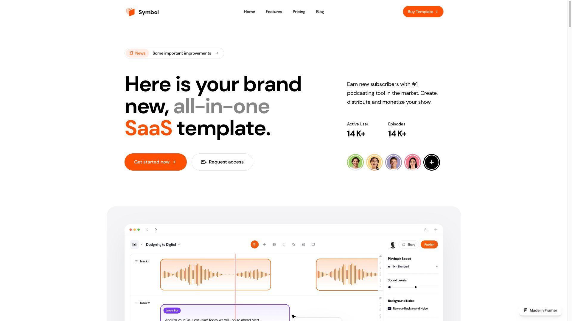
Symbol
My favourite template, spacing and colors look polished and clean, the CTA (call to action) is well positioned and functional, there isn’t too much animation (one of the main problems with Framer templates).
This template has a professional, clean, minimalist aesthetic. The overall design is crisp and elegant, with a focus on white and light tones. The spacing is clean and organized, allowing key information to stand out.
The typography is modern and legible, adding to the template's professional look. This template is perfect for anyone looking for a refined and polished design, with a touch of vibrancy through the use of orange accents.
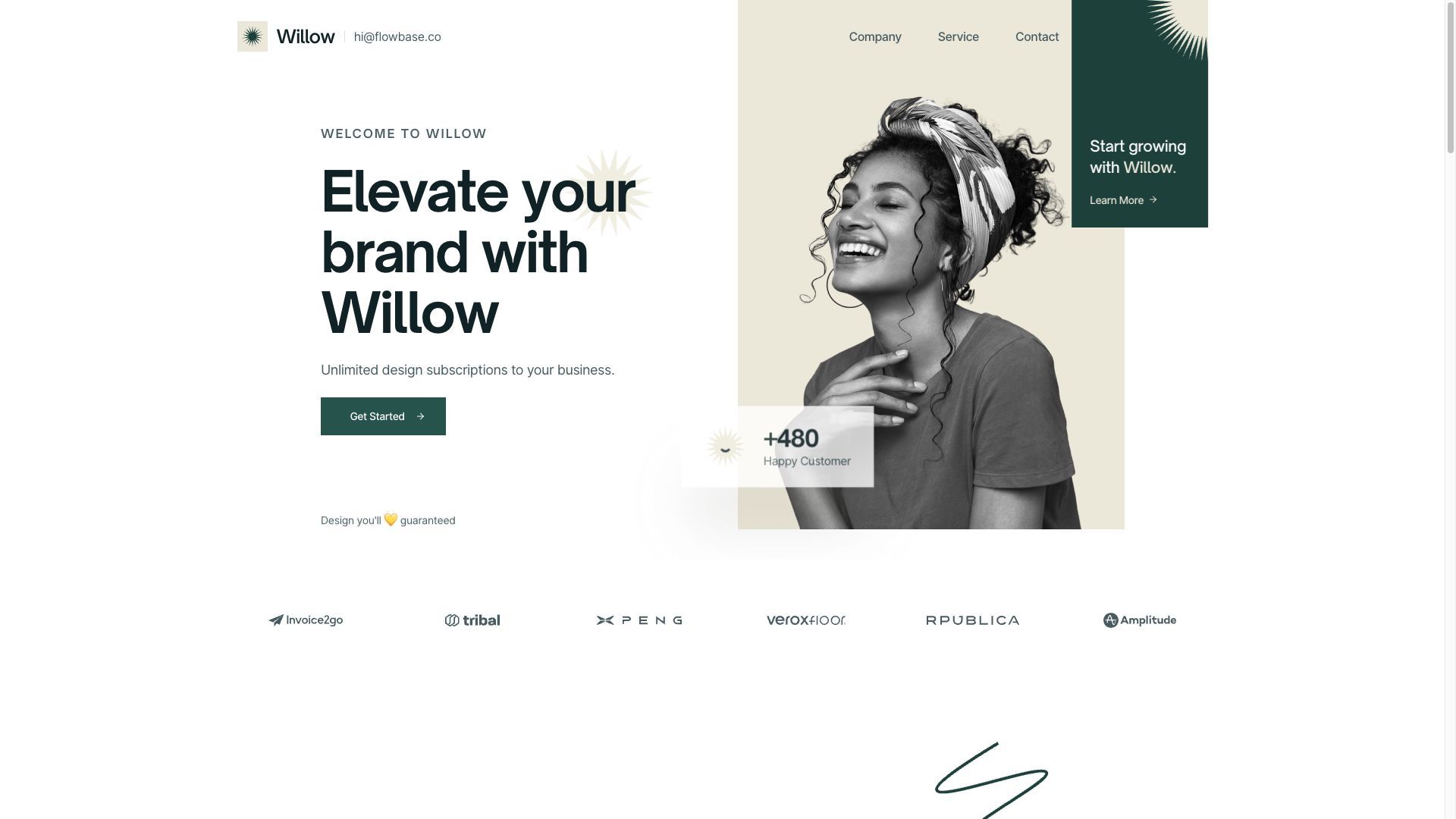
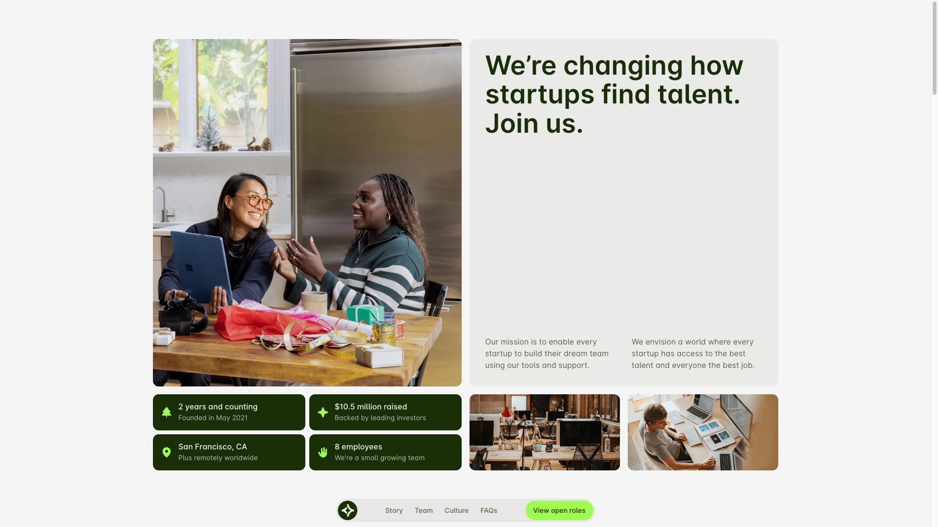
Willow
Very elegant template with a dark green primary color. Very elegant style with polished colors and spacing.
The Willow Template emphasizes photography and modern style. iI's made for service firms who wish to showcase their work. For top-tier production houses and advertising firms, Willow is ground zero.
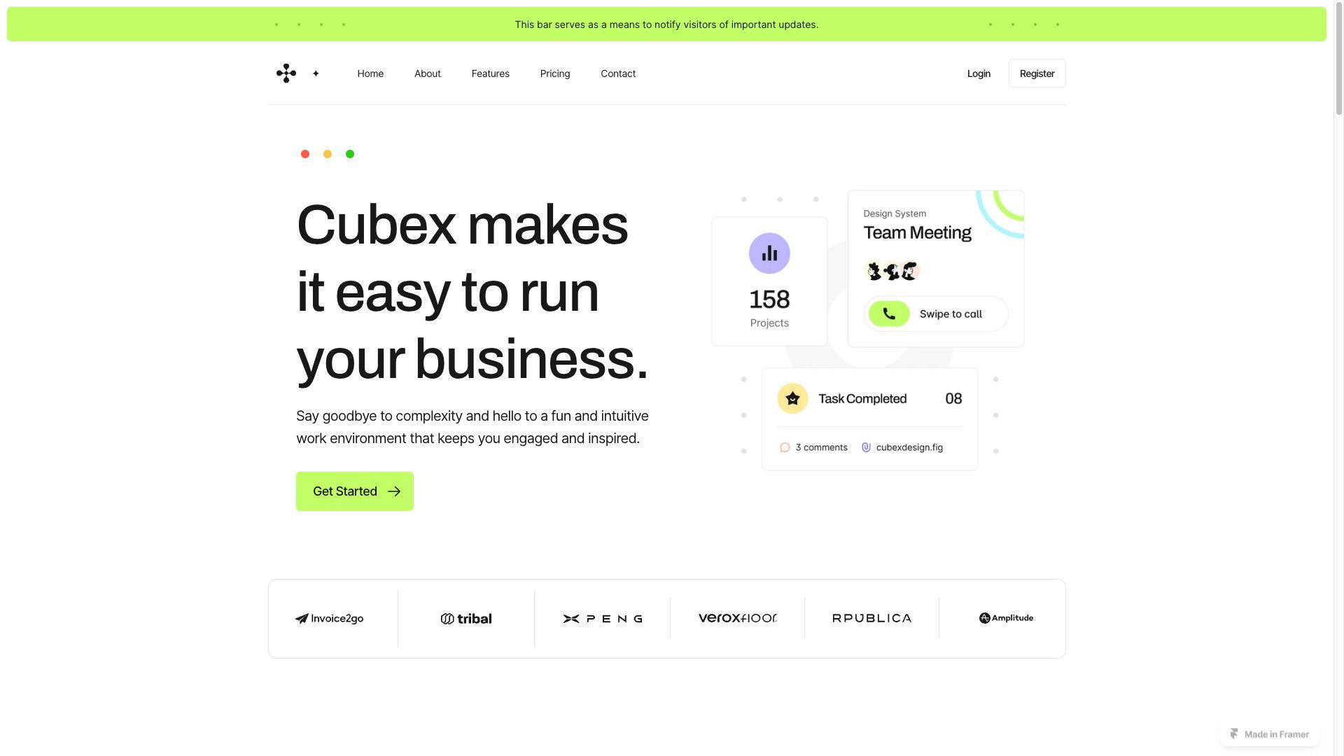
Cubex
Clean light template for SAAS. Cool style with thin borders and decorative dots.
Sleek and polished template with a primary color scheme of yellow. This template exudes professionalism and a clean, minimalist aesthetic. The predominant use of white and light tones throughout the design creates an overall sense of elegance and sophistication.
The template's spacing is meticulously crafted to ensure a clean and organized layout. Ample white space is employed to give content and elements room to breathe, enhancing readability and allowing key information to stand out. The balanced spacing contributes to a sense of professionalism and clarity, making it easy for users to navigate and find what they're looking for.
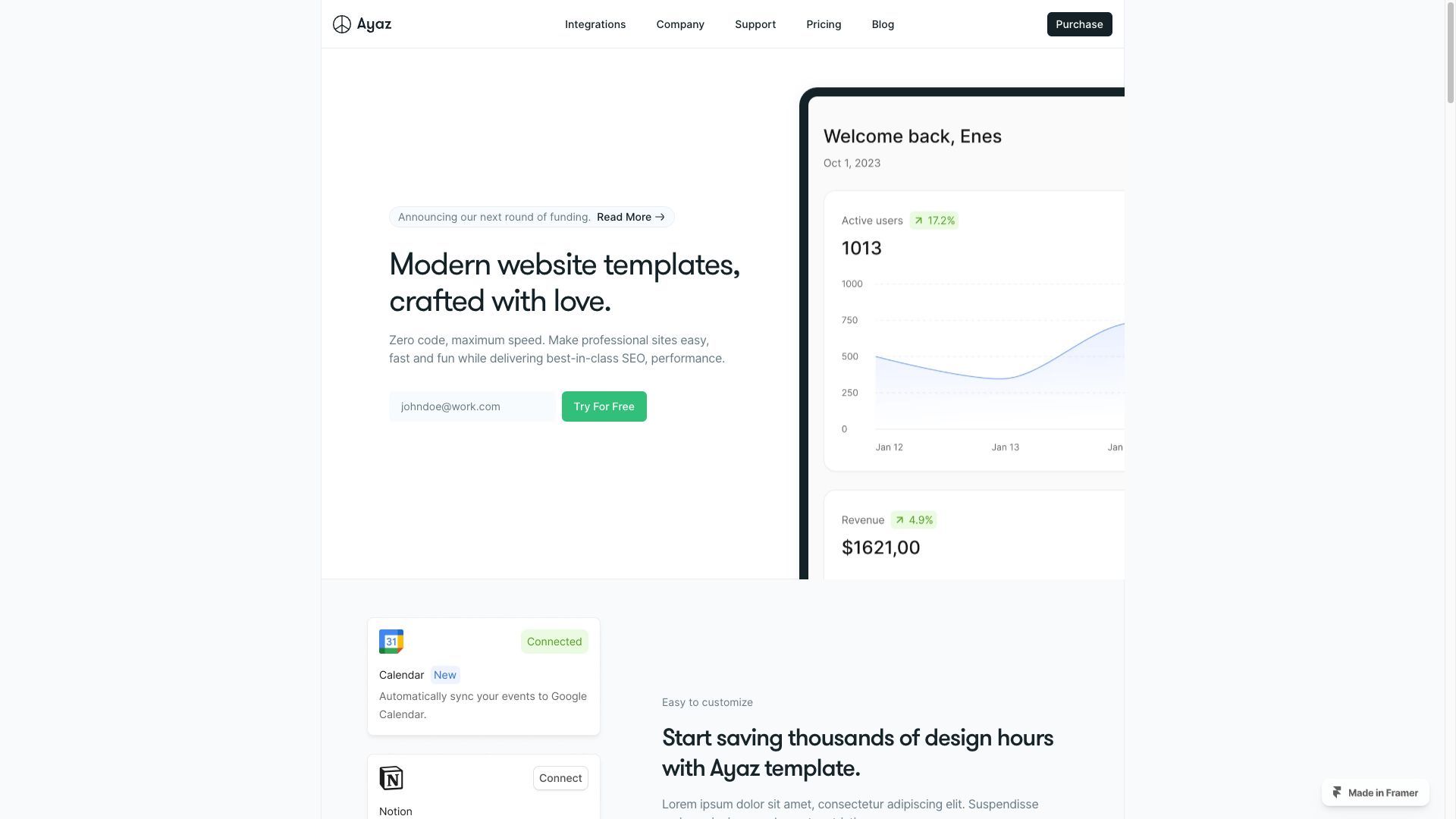
Ayaz
Template with a captivating layout that cuts the main content in a column at the center of the page, creating a contrasting effect that looks elegant and polished.
Perfect for SAAS and digital companies as you can replace the hero image with your own website screenshot.
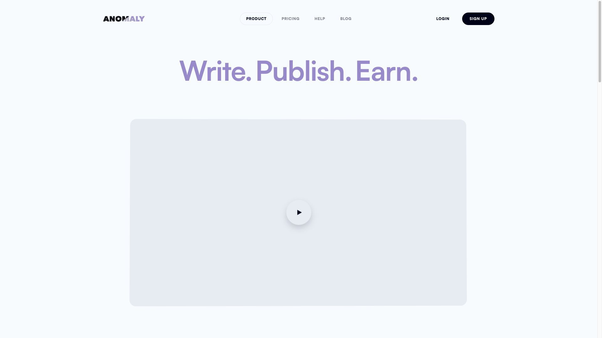
Anomaly (free)
Very simple template with a very cool animation on the hero heading text.
You can replace the hero video with your own and get a very sleek landing page quickly.
Glitzz
Captivating Framer template with a main color palette of pink. This template combines the charm of pink hues with a modern and stylish design.
The vibrant pink color infuses the template with a sense of playfulness and creativity. The layout is clean and well-structured, allowing your content to shine.
Style is playful and engaging, perfect for startups in the analytics space.

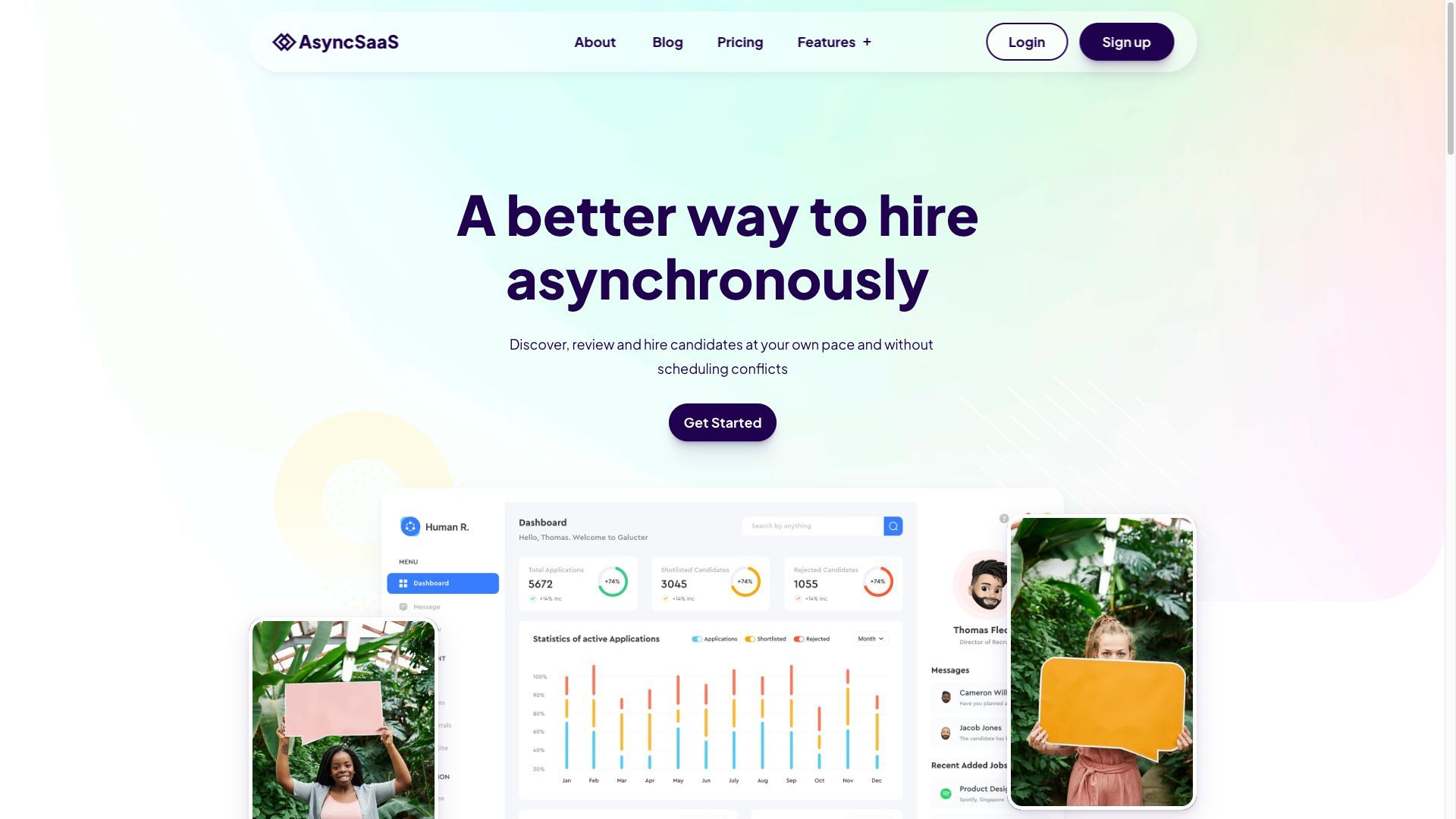
AsyncSAAS
Sleek background gradient and mix of harmonious colors.
Designed specifically for hiring agencies. It's filled with playful colors in a gradient that spans the entire screen. The colors are vibrant and lively, creating a fun and energetic atmosphere.
The typography is modern and bold, adding to the site's professional and confident vibe. Overall, this website is a visual treat that captures attention and leaves a lasting impression on hiring agencies.
Hirelane (free)
Template with a very modern layout, not something you see every day browsing the web. The features cards have very cool animations on hover that make the website interactive and dynamic.
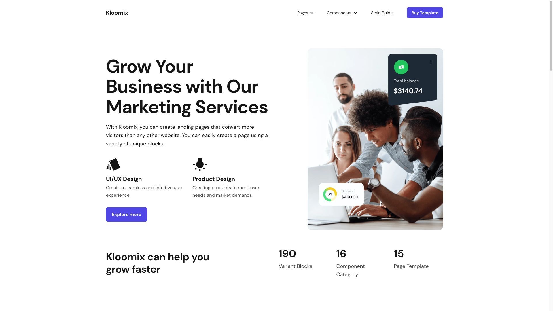
Kloomix
Kloomix is a modern and sleek website template that allows you to create a strong online presence with ease.
The beauty of Kloomix lies in its clean and minimalist design. It offers a straightforward and intuitive interface that puts your content at the forefront. You don't need to worry about flashy elements or complex layouts; Kloomix lets your content shine in a visually appealing and effortless manner.
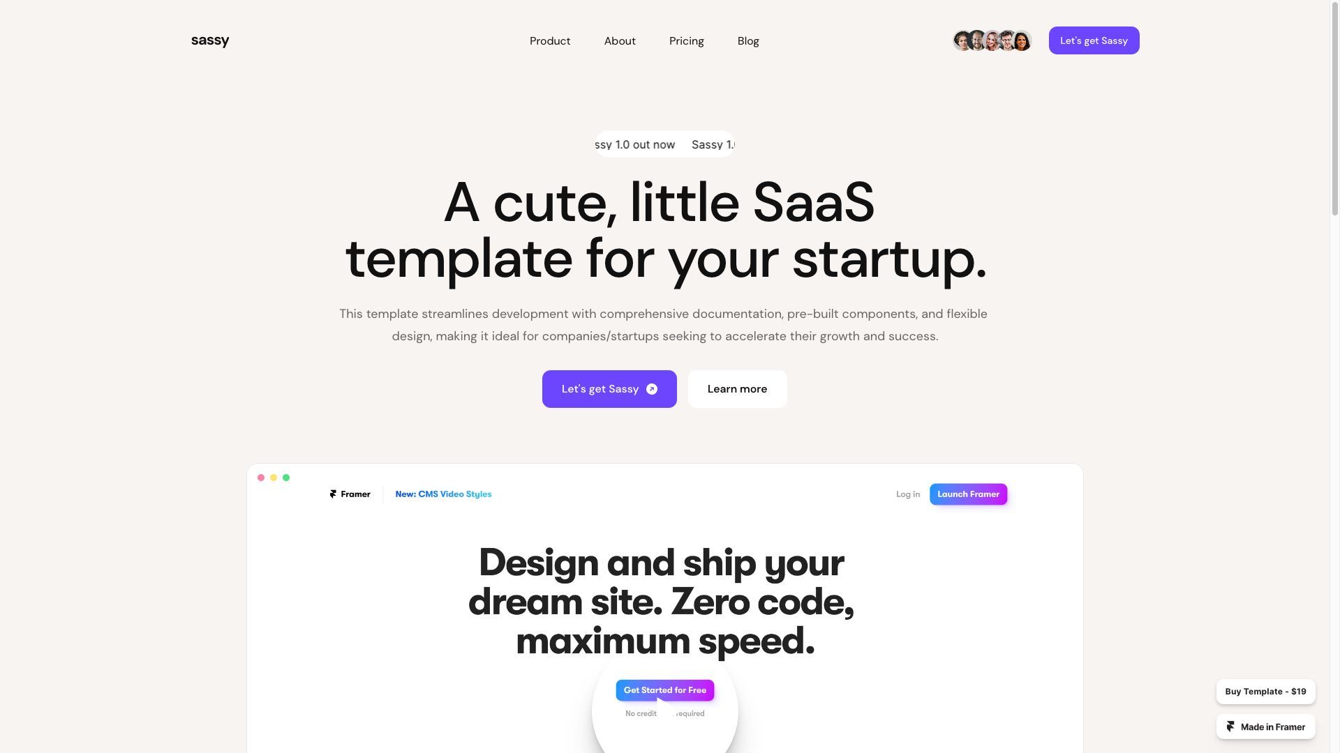
Sassy
Light template that exudes elegance with its warm colors, refined font choice, and well-crafted layout.
The warm color palette creates a cozy and inviting atmosphere, while the elegant font adds a touch of sophistication. The layout is carefully designed to ensure a clean and organized appearance, allowing your content to take center stage.
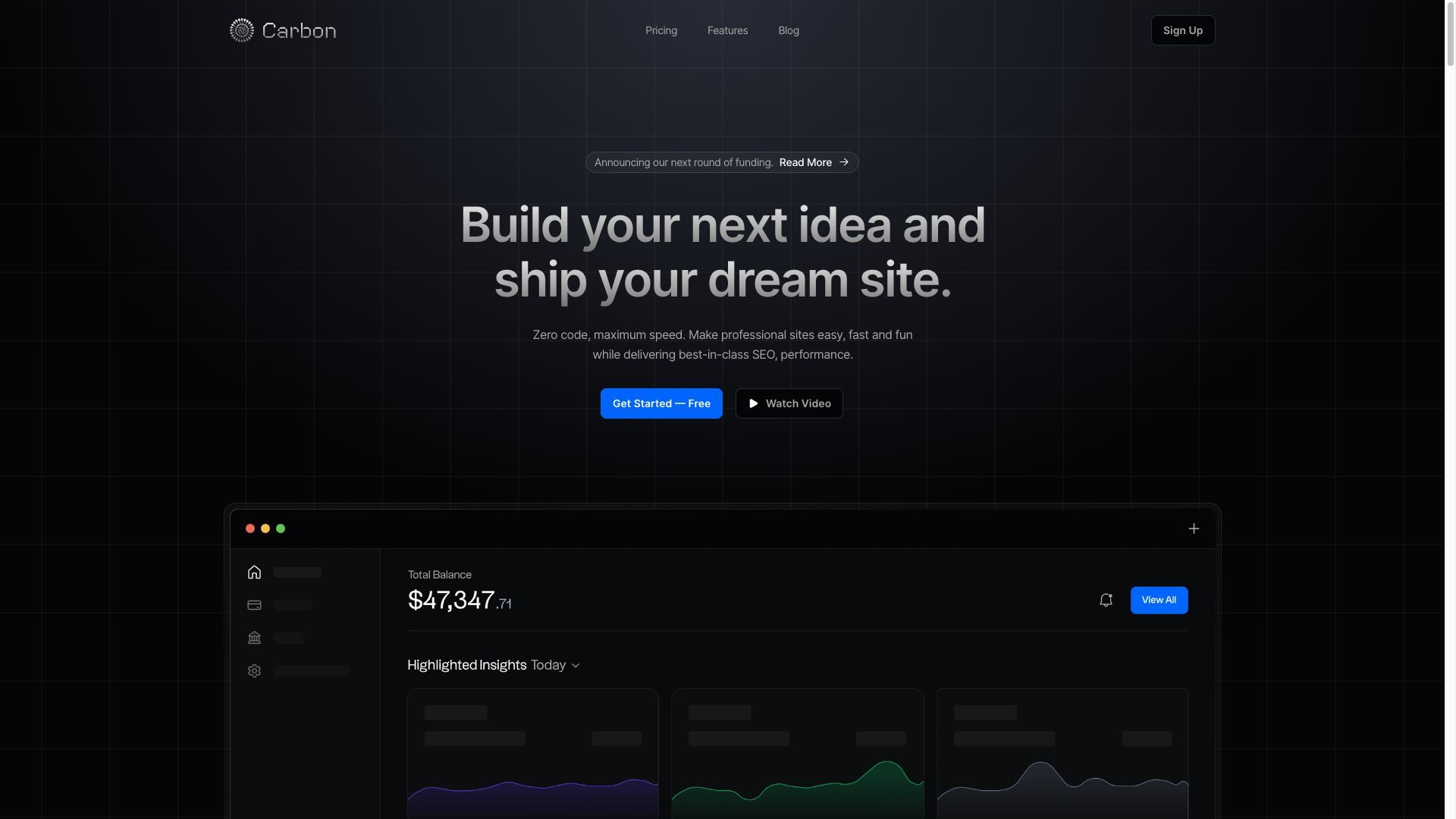
Carbon
Template with a catchy modern dark theme. It also has a blog and pricing.
Perfect for futuristic SAAS landing pages that love the dark side.
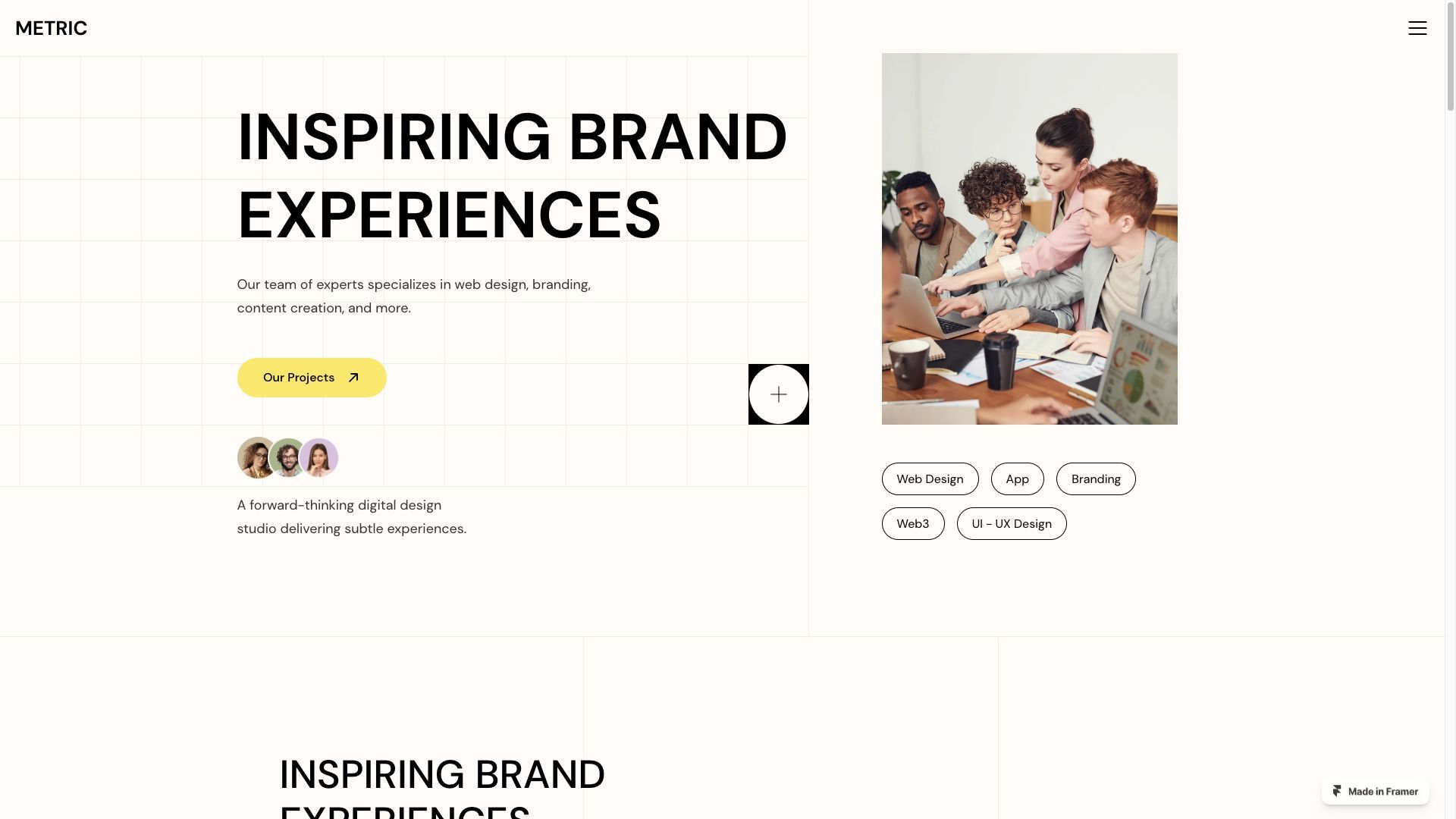
Metric
Modern template with a brutalist style with very little separation of sections. Not my favourite style but perfect for companies that search for this kind of design: modern and minimal.
I picked my template, now what?
After you choose your template you will need to replace copy, images and links with your own inside Framer.
In case the template your picked is missing some elements like blog or pricing you can buy another one and copy paste the parts you need, Framer makes it very simple.
If you need help doing this write me an email at [email protected] (price starts at 1k for each website).

